Monday, July 21, 2008
Tuesday, July 8, 2008
Thursday, July 3, 2008
Skin Beautiful
A new cosmetic product launch campaign for a school project (Photographs by Victoria Secret):
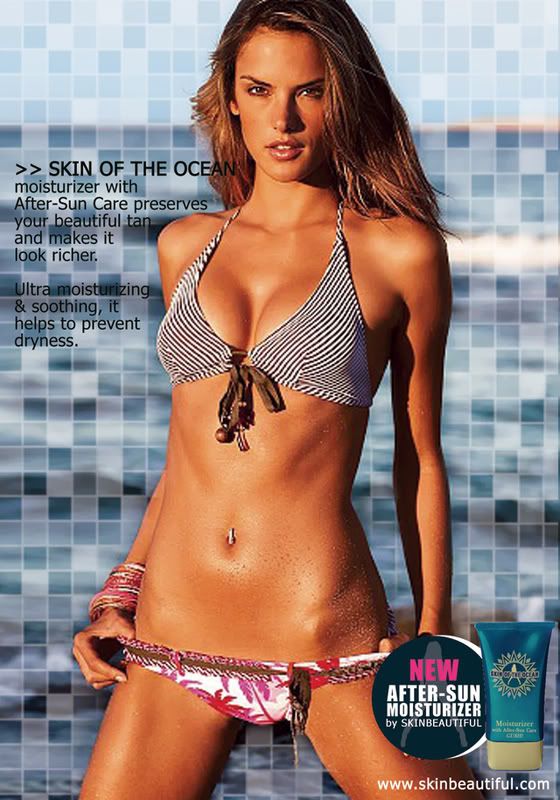
Skin of the Ocean moisturizer advertisement:
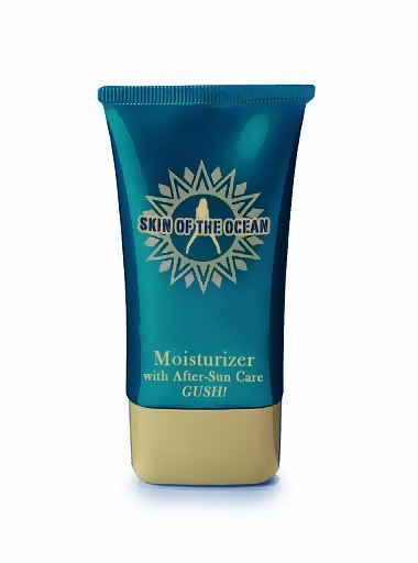
Package design #1 - After-sun care moisturizer:
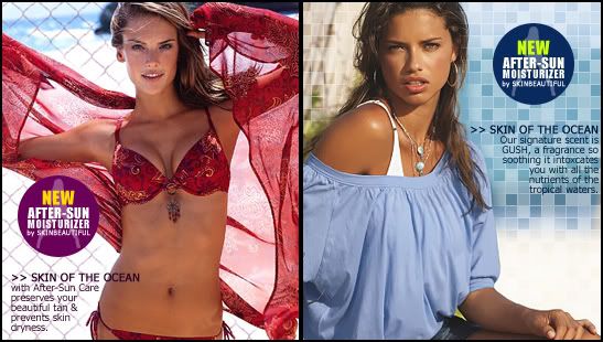
 2 Web Banners:
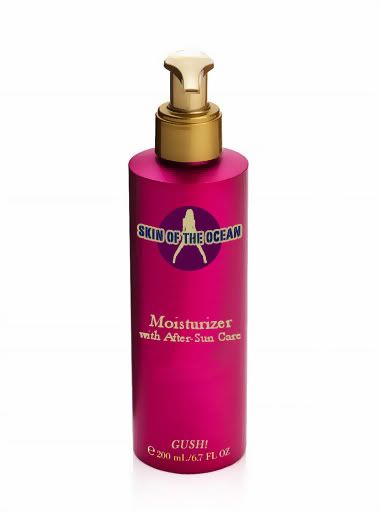
Package Design #2:
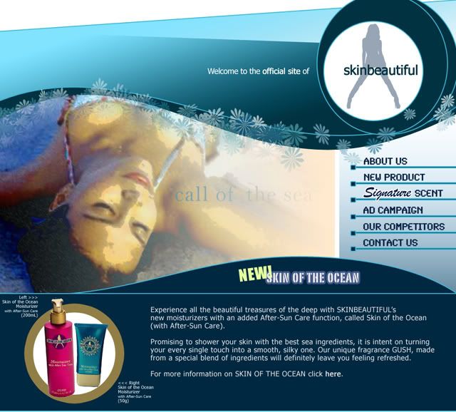
 Website mock up for the company skinbeautiful:
No animal testing web banner:

Skin of the Ocean moisturizer advertisement:

Package design #1 - After-sun care moisturizer:
 2 Web Banners:
Package Design #2:
 Website mock up for the company skinbeautiful:
No animal testing web banner:

Labels:
advertisement,
cosmetics,
posters,
product launch,
product package,
school,
web banner,
website
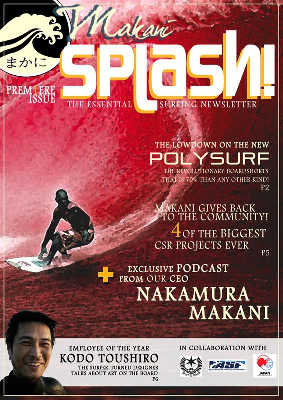
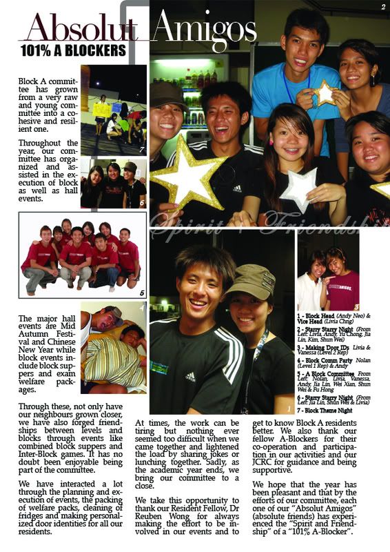
Makani Surf Newsletter
A joint production for a school project - Makani Surf Newsletter (inside pages and layout done by me):
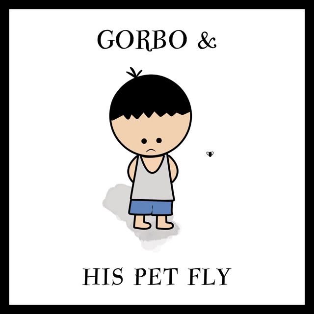
Gorbo & his pet fly - Children's storybook
A joint production for a school project - A children's storybook:
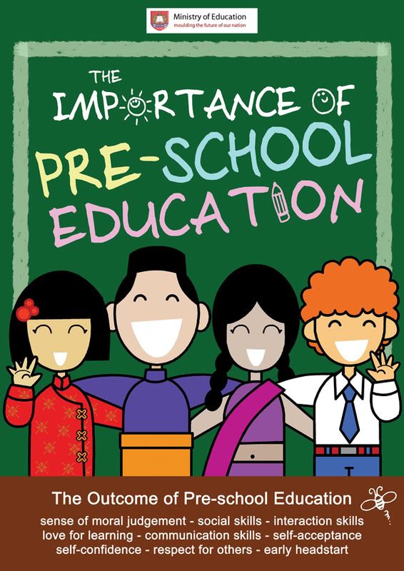
Importance of Pre-School Education
Singapore Zoo: Get with the times!
A mock-up advertisement series for the Singapore Zoo to encourage youths to visit the zoo and to find out what they've been missing over the years (as research showed that teens haven't been to the zoo since they were children). The concept is as such -
Horse with braces...

Meerkats & Music...
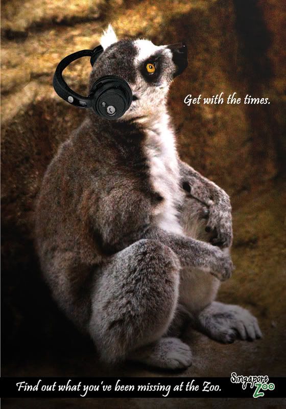
Funky Monkey...

Horse with braces...

Meerkats & Music...

Funky Monkey...

Wednesday, July 2, 2008
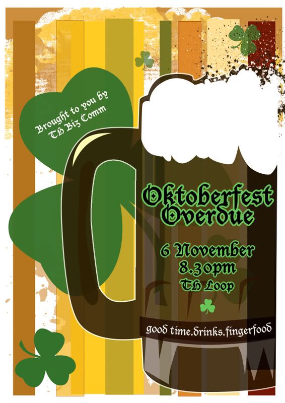
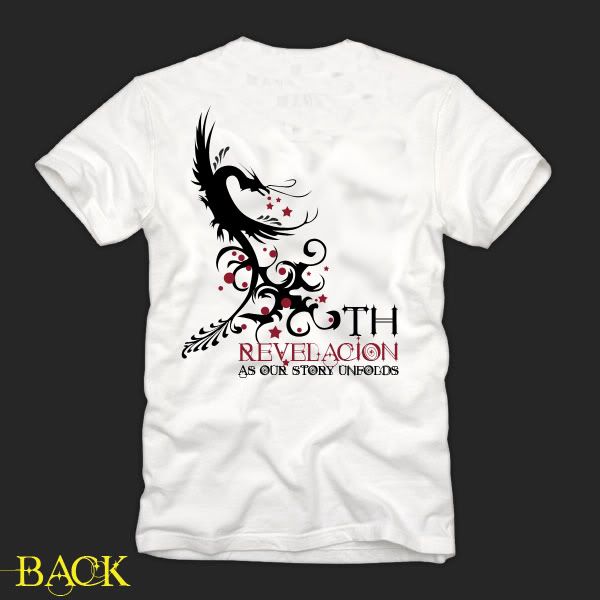
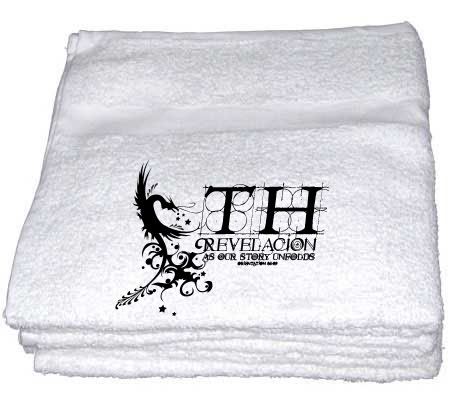
Revelacion - Orientation Set
Tuesday, July 1, 2008
Health Hub - How our body works
Concept & execution work for a design company. The company needed some way to decorate the walls with educational posters as well as the cupboard doors.
The idea I developed was to fill a health education room in a primary school with fun, educational materials that was both eye catching and interesting. Interactivity was of key importance.
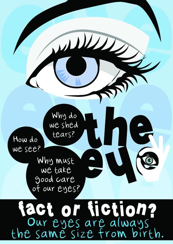
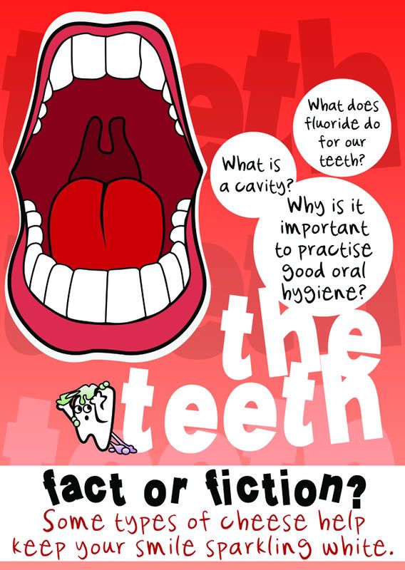
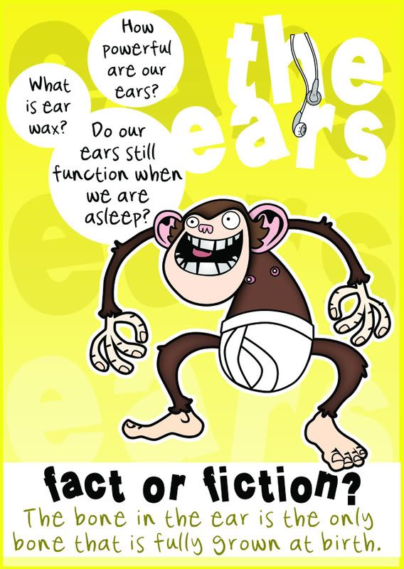
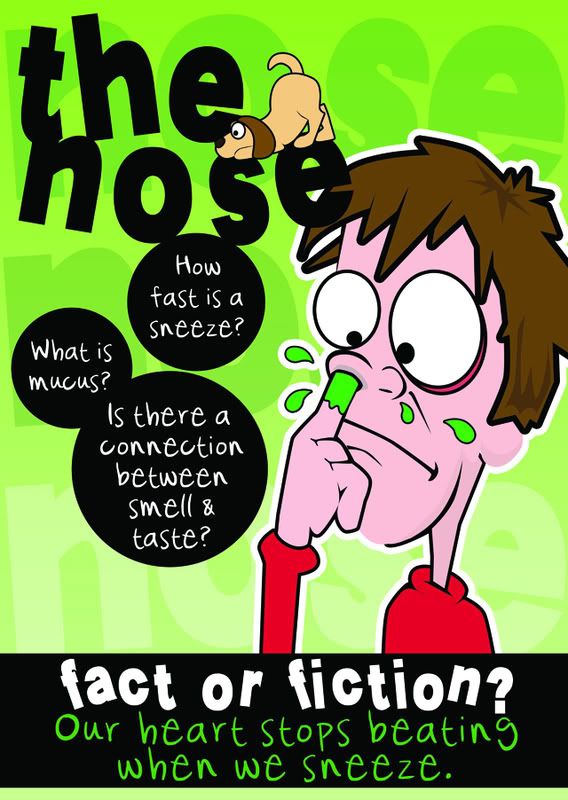
The posters mounted on the walls were supposed to be "teasers" so that students will be intrigued enough to find out more from the large placards (mounted on the cupboard doors) containing health articles, activities, etc. found on washable placards fostering interactivity and team work among students.
Posters:
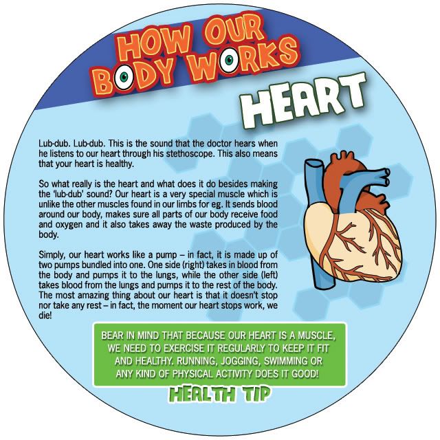
Placard Sample - Back/Front:
Preview visual:
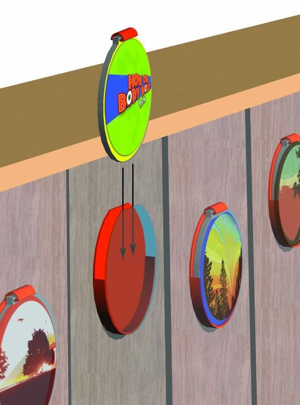
The idea I developed was to fill a health education room in a primary school with fun, educational materials that was both eye catching and interesting. Interactivity was of key importance.
The posters mounted on the walls were supposed to be "teasers" so that students will be intrigued enough to find out more from the large placards (mounted on the cupboard doors) containing health articles, activities, etc. found on washable placards fostering interactivity and team work among students.
Posters:


Placard Sample - Back/Front:


Preview visual:

iMAD - i make a diffference
Subscribe to:
Posts (Atom)

